Lion Homes
Brand identity design | Brand guidelines | Logo design | Brand workshop | Branding | Website Design | Brand/Key Messaging
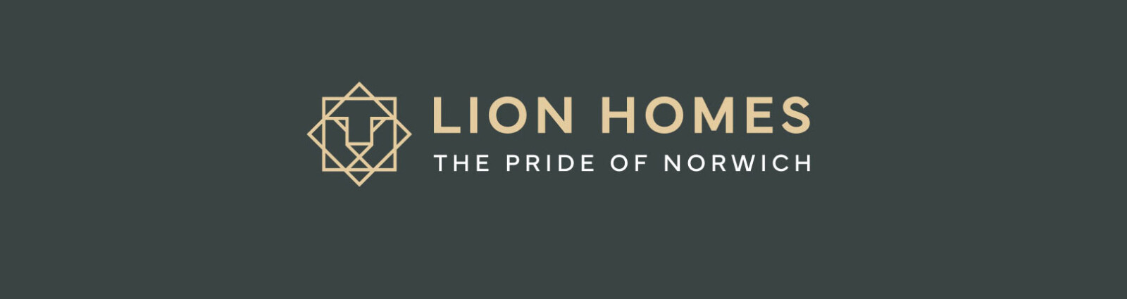
The Pride of Norwich
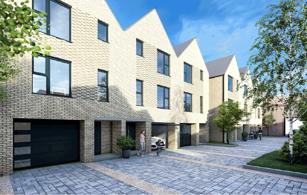
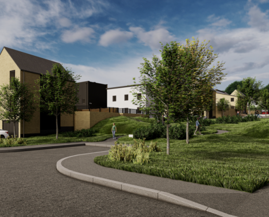
Lion Homes is a modern housing developer, wholly owned by Norwich City Council. It exists to build high quality homes that are environmentally, socially, and economically sustainable – for the benefit of everyone that chooses to live in our fine city. A strong identity with a striking visual and poignant purpose would help the Lion Homes brand communicate proudly to everyone in Norwich and beyond.
Building our understanding
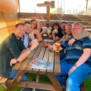
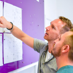
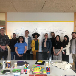
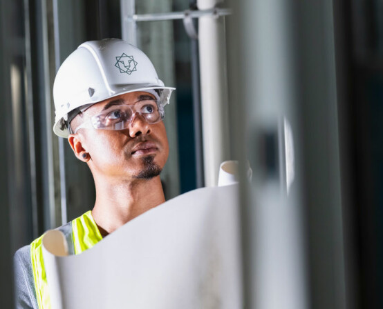
Before crafting visuals or messaging, we wanted to fully understand Lion Homes’ vision, values, product, and the priorities of different stakeholders – this isn’t a traditional house builder and there are significant social and shareholder outcomes that Lion Homes is working towards. Our brand workshop at City Hall, overlooking the city, enabled us to start piecing together the core components of the brand: ideas for strategic direction and positioning and the perception we wanted to create for Lion Homes.
The pride of Norwich
Norwich is at the heart everything Lion Homes does. It is a brand that wants to be as big a part of the city as the city is part of it. Here to meet the growing demand for affordable, efficient, well-managed homes and create sustainable, desirable communities for the benefit of everyone in Norwich and beyond. Putting people, place, and the planet before profit.
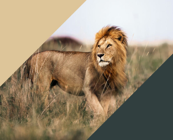
A symbol of pride
We had to create a brand identity that felt like it belonged to Norwich, beyond the immediate connection the city has with the lion. One of key take-outs from our strategic work was also the concept of pride – Norwich has a proud history of providing Council Housing, Lion Homes should be proud of its link to the City Council. Lions too live in prides – a safe social environment with togetherness and community.
The creative work involved presenting how we would tell the story of Lion Homes, along with four different visual routes for the brand’s identity, each true to the underlying strategy but a different take on how to bring it to life visually.
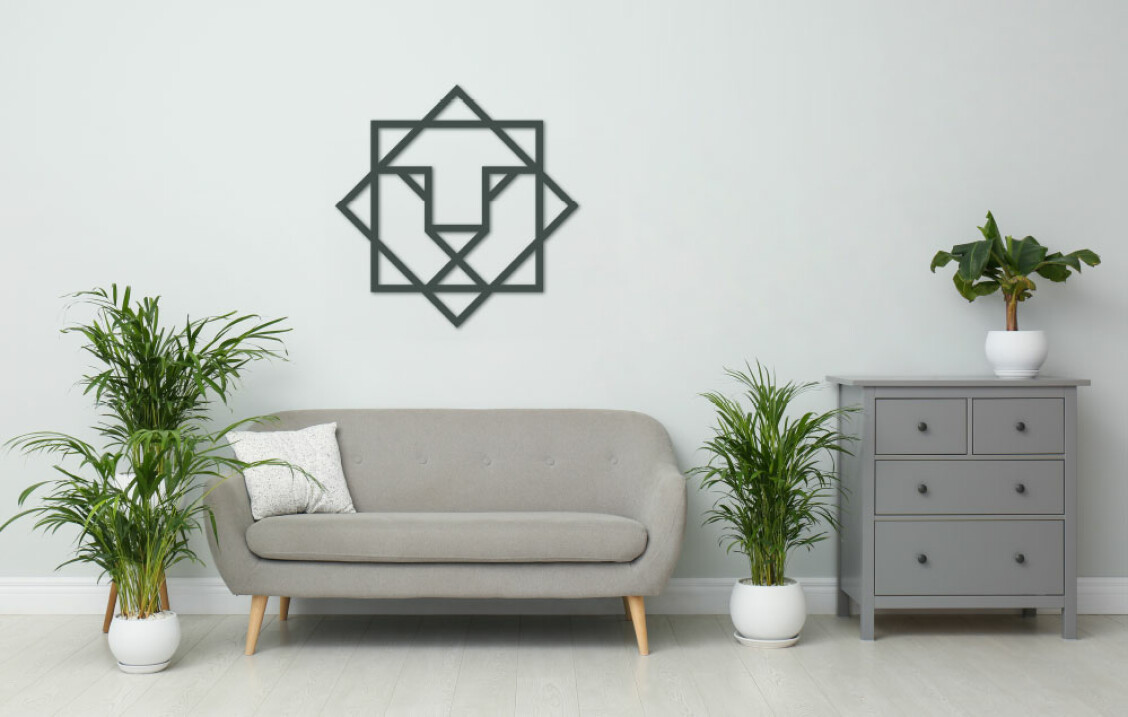
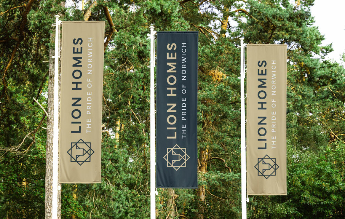
The solution we focused on used a modern, geometric lion icon with a combined upward arrow, representing Lion Homes’ commitment to prosperity, and a lion’s mane to symbolise community and togetherness. With a supporting modern and strong logotype.
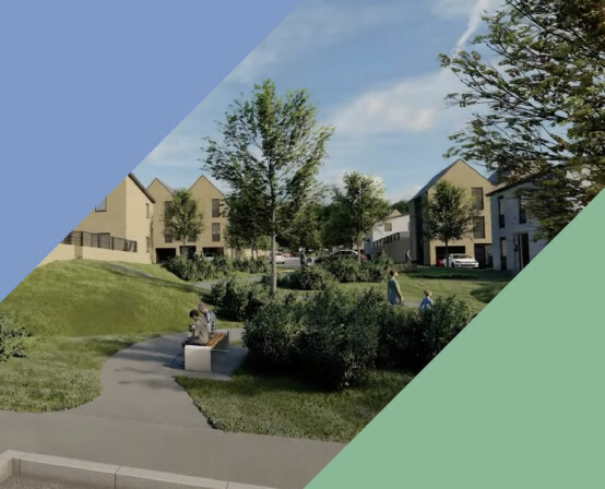
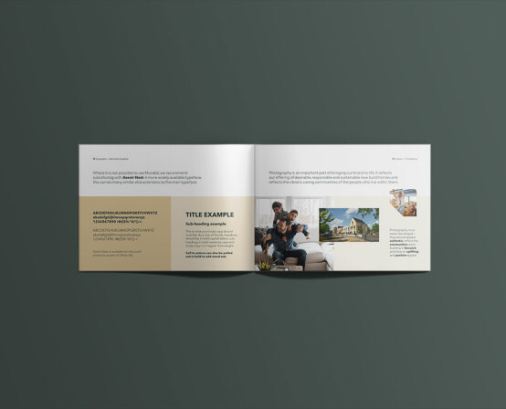
The colour scheme is warm and classic – influenced by lions themselves. The secondary tones of green and blue nod to sustainable environments, green community spaces and big blue skies – adding energy and vitality to the more traditional gold and black.
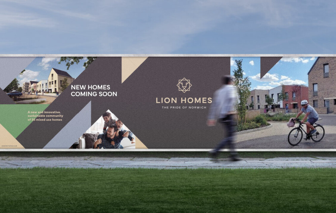
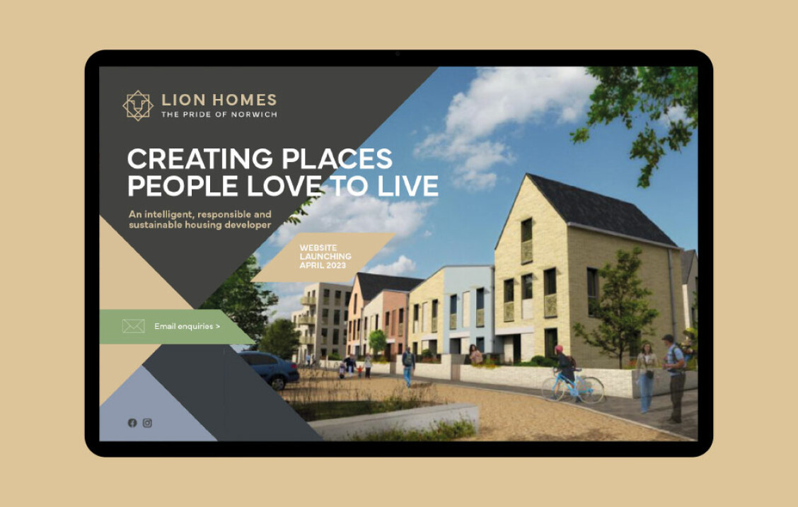
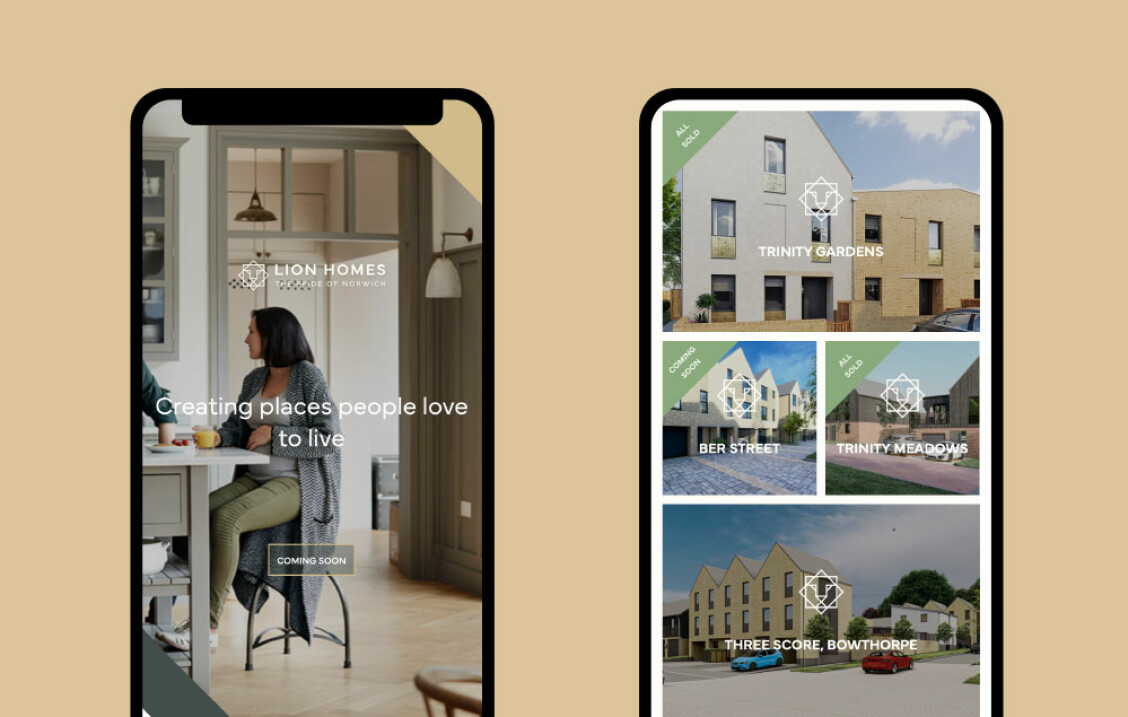
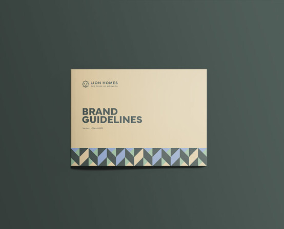
Once the branding was completed, we detailed all the components of the story and guidelines for using the visual identity in a useful brand book. As the brand develops, we have continued to work with Lion Homes to create a series of report style templates, signage for new developments and a customer-facing website.
“From the off Naked understood my vision for this brand. It’s clear that they listened and understood what we were trying to do. The Lion Homes brand they have helped us to create is something our city can be proud of and will help us deliver on our vision for creating high quality homes that are environmentally, socially, and economically sustainable.”
Managing Director, Lion Homes.