Design
Diving into colour
By Jodie Cole
07/05/24
Have you ever wondered why when you see a red double decker, you think of London? Or how a small light blue jewellery box can evoke a sense of exclusivity and luxury? Or why we flock to fields full of vibrantly coloured flowers in spring?
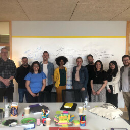
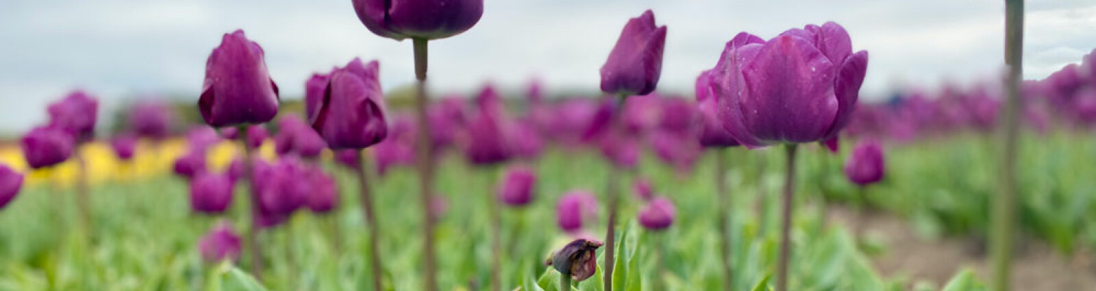
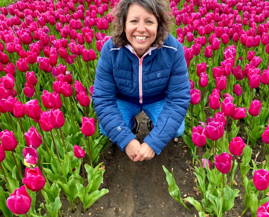
Well, mid April I was lucky enough to be invited along to experience Norfolk Tulips beautifully coloured fields by Naked’s Head of Marketing, Natalie Douglas. The trip got me thinking alot about colour, how it impacts us and, for me in particular, how it is such an important aspect of my life and work.
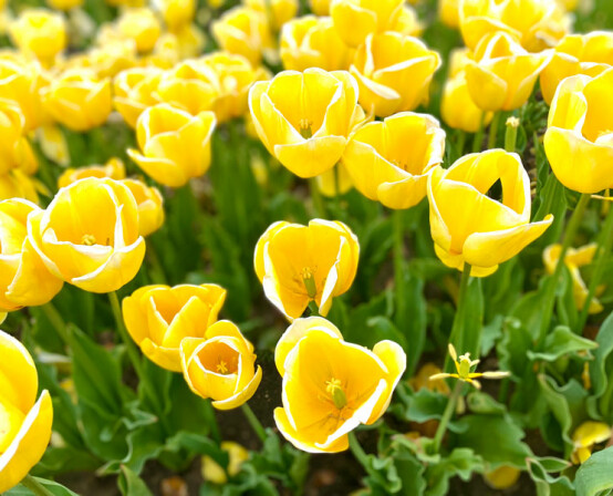
Colour is certainly an ever-present part of our visual experience. From the soothing hues of a sunset to the vibrant palette of a tulip field, it influences our perceptions, shapes our preferences and can even impact what we buy and how we behave.
We should understand that colour is not just a visual element; it's a language, a way to express ourselves. It communicates emotions, evokes memories, it sets a tone. I read a book a while back about how joy can be found all around us, even in seemingly ordinary things. How the natural and often colourful vibrancy of our surroundings is actually our most renewable and easily accessible joy. How great does that sound! For me this might explain why I’ve found myself over the past few years injecting more bright fun colours into my everyday life through my clothing and the car I drive for instance. It makes me feel brighter, sunnier, better and I hope inturn that rubs off on others too.
In the realms of graphic design, colour is more than just some RGB or CMYK values or a Pantone swatch. It's a powerful tool for communication and expression. By mastering its key principles and understanding its psychological impact, we can create work that's visually striking and well-balanced.
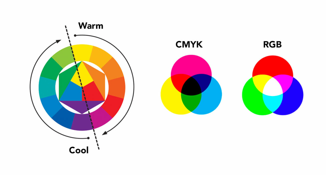
At the heart of colour theory you’ll find the colour wheel – a rather pretty circular tool for designers that represents the colours of the visible spectrum and their relationships to one another. Then there’s contrast and harmony. Contrast creates visual interest by mixing varying tones, saturations or brightness levels whilst harmony ensures that colours work together cohesively. By carefully selecting colours, tones and harmonies that align with a brands values and target audience, businesses can establish a strong and memorable identity. Think of iconic brands like Coca-Cola's bold red, Starbucks' calming green, or even Naked’s creative purple. These colours have become synonymous with their respective brands, instantly recognisable and deeply ingrained in consumers' minds.
And, just like any other aspect of design, colour trends evolve over time. From the vibrant hues of the 80s to the minimalist palettes of today, colour trends reflect social shifts, technological advancements, and cultural influences. As designers, staying abreast of these trends and experimenting with innovative colour combinations allows us to push the boundaries of design and create fresh, engaging visuals.
So what’s all this got to do with a trip to a field of flowers? Well, not only did it prove an excellent reminder to me of the importance of getting out of the office, to get a break from the day-today busy-ness and to take in some inspiration in a very natural and non-digital form, it also invited me to immerse myself into the colourful great outdoors! Try it! It really can lift your spirit, give you some headspace and enrich your enthusiasm to get stuff done!