CGM Group
Brand identity design | Brand guidelines | Design for digital | Digital marketing
Brand enhancement for growing business
The existing brand identity was identified as a weakness
The CGM brand required a shift - from portraying a ‘small local company done well’ to positioning themselves as a significant player in the grounds maintenance sector. The existing brand identity did not reflect an innovative, robust and growing business and - as such - was identified as a potential weakness for the business. Naked were challenged to evolve the brand identity to better represent the CGM Group today, whilst staying true to the values and quality that existed in the established brand.
Evolving the brand to better represent the business
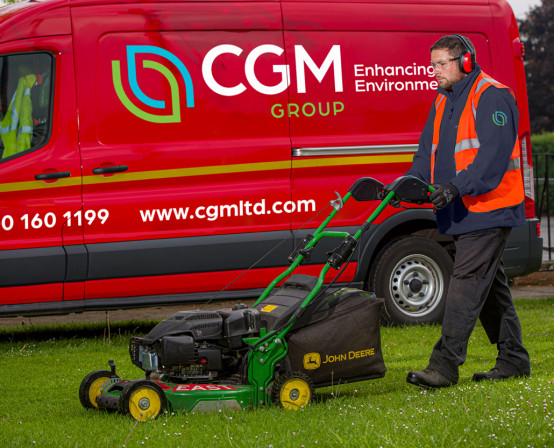
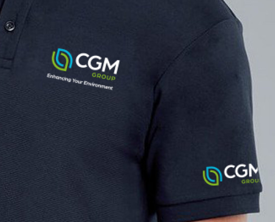
Following a close look at other brands in the sector, a workshop at CGM’s impressive HQ and a review of all the different ways in which the CGM brand identity is used, we identified how the CGM Group branding could be developed to better represent the business. Not only did we identify what could change, but also what should remain. For example, the red vans were a strong and distinctive part of the CGM branding, therefore, we recommended that they stay red, and our designs were all considered for use on red.
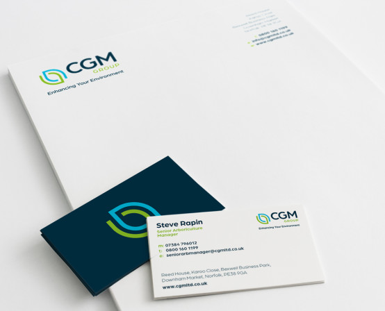
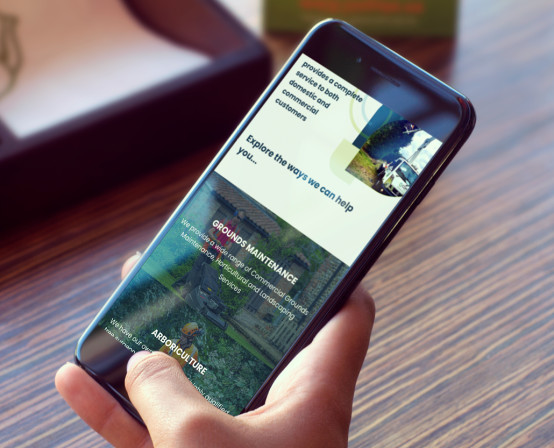
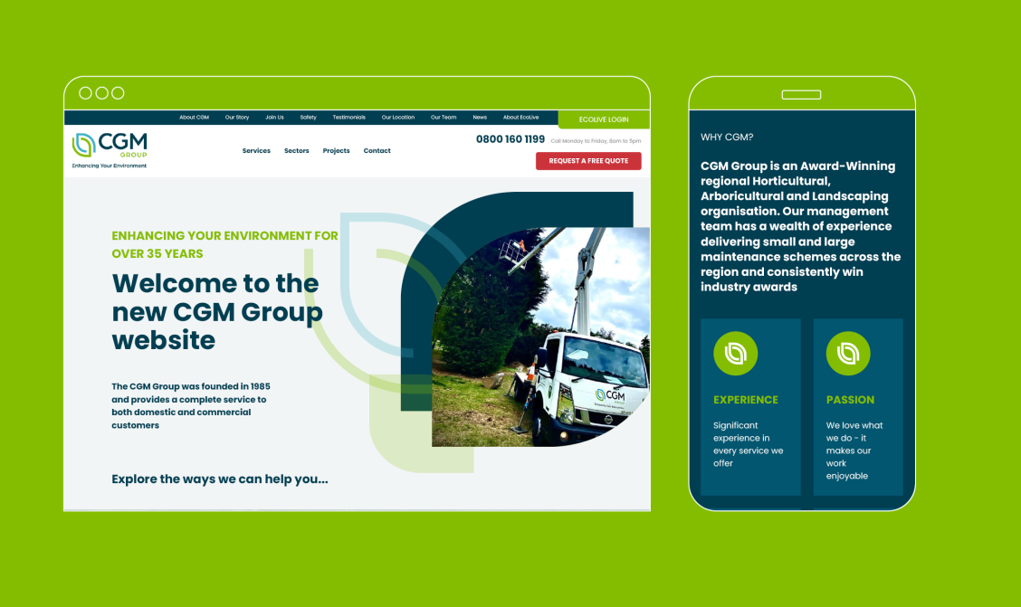
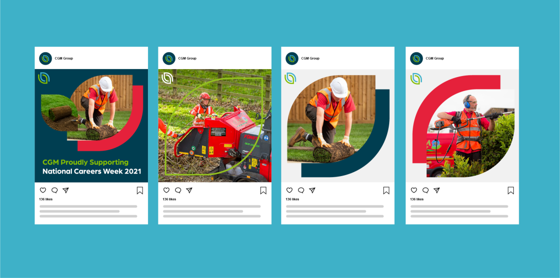
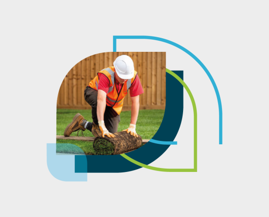
Next, we proposed a series of design concepts. Each design was built upon a core concept that existed in the way that CGM do business. We explained our thinking behind each idea and then worked with CGM to refine and develop favoured approaches. The identity was brought to life on vans, uniforms and graphics for social media as well as a new website to give CGM a real taste of how the identity worked as a system.
New branding boosts confidence and provides platform for growth (no pun intended!)
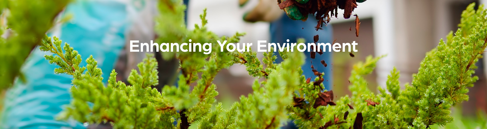
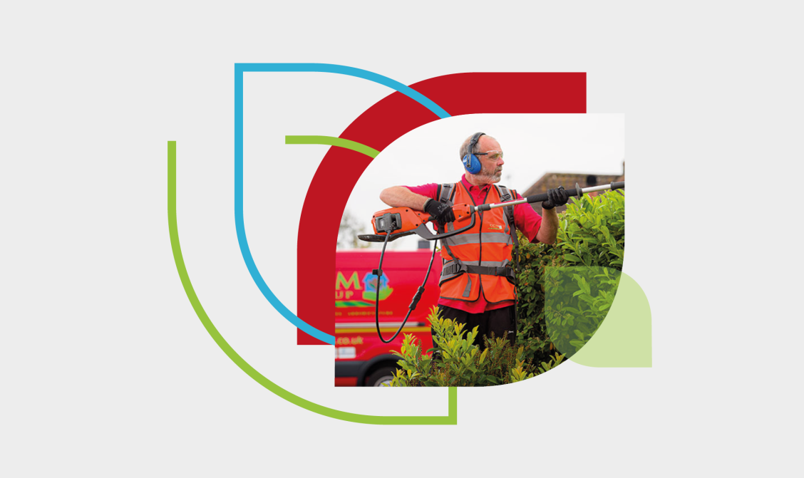
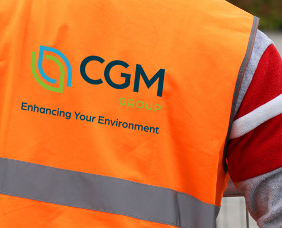
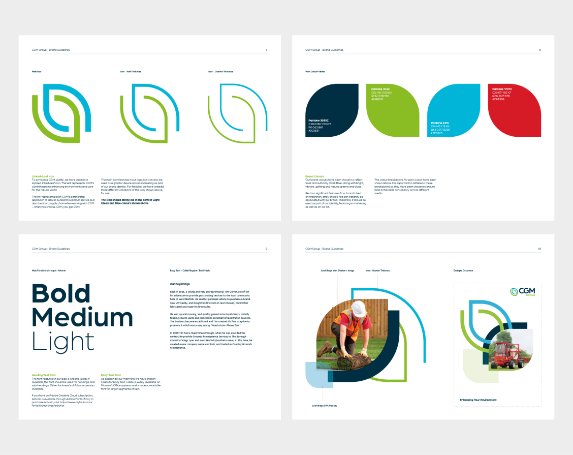
CGM now has a brand identity that reflects the company it is today. The identity can now be considered a strength of the brand, not a weakness. The concept behind the design starts at the environment which is represented by the contemporary leaf graphic – developed from CGM's core purpose to 'Enhance Your Environment'. Made up of two parts, this symbolises CGM’s commitment to the customer: working closely in partnership to deliver the best and a culture that is built upon delivering quality.
A modern and dynamic identity, it is flexible for use across different applications which creates variety whilst always being identifiable as CGM.
The new branding has given CGM the confidence and the platform from which they can push on with their growth and success strategy.
The identity can now be considered a strength of the brand, not a weakness